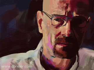
Time lapse video of iPad portrait of Bryan Crantson being drawn. The finished portrait is below.
The preliminary drawing, focal points and compositional choices
I recently completed an iPad portrait of Jennifer Carpenter, who plays Debra Morgan on Dexter and I was somewhat disappointed with it. The finished portrait looked too stiff. I spent too much time on the details and I felt that the next portrait should be more expressionistic and fun.Working from the general to the specific is a painting technique that I use where I start with the basic shapes and progressively refine the details as I go. Painting the general shapes quickly eliminates the white of the canvas and gives me something to react to. I can then make judgements about the proportions, colors and composition. If you watch the time lapse YouTube video, you'll notice that I make a major correction in the very beginning, where I actually move the drawing over to the right so that his head wouldn't be in the center of the frame. The first rule of composition is to avoid centering the subject matter, because that's boring!
The focal point of this painting are his eyes and notice that I've placed them towards the top right corner. Placing the subject to the right also creates more interesting background shapes. There's a larger dark shape to the left with a smaller shape to the right. If I had placed him in the center it would have created two very similar background shapes. Variety is far more interesting than repetition.
 |
| iPad Portrait of Walter White from Breaking Bad. Drawn with the Brushes app. |
Draw the shapes and the subject matter will take care of itself
Instead of approaching this as a painting of a face, I just focused on the abstract patches of colors. It's much easier to think about replicating a patchwork of abstract shapes than it is to draw a concept, such as an "eye" or a "nose". Draw the shapes and the subject matter will take care of itself. As the drawing progressed, I made more corrections and I added the finer details on top of the looser, bolder brushstrokes.The final step was to make a few minor color adjustments in Photoshop. The iPad doesn't provide support for color management, so ocasionally the colors will appear slightly different than how they appeared on the iPad. The flesh tones had a slight green tint to them and that was easy to correct with a color balance adjustment layer in Photoshop.
If you like this you may be interested in more of my iPad Art
No comments:
Post a Comment