 | |
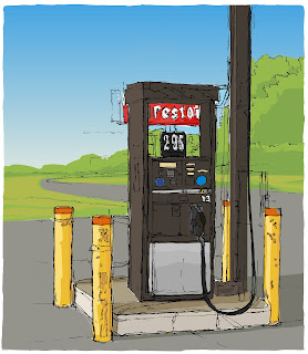
| "Diesel" © Chris Breier 2012 Drawn with traditional pen and ink. Colored with Adobe Ideas and Illustrator. |
THE SKETCH
I brought my sketchbook along with me to the mechanic so that I would have something to do while my car was being repaired. Once I handed over my keys, I rushed outside to look for interesting subject matter. I started a number of sketches before I settled on this diesel gas pump at vacant gas station near the Buffalo Niagara International Airport. This was a challenging location to work in as there were airplanes flying overhead and cars racing by.I started the drawing by focusing on the numbers on the sign at the top of the pump and worked outwards from there, much like starting at the center of a maze and working my way out. The idea is that once I have something captured on paper, such as the numbers in the price, it can then be used to gauge the size of everything else around it. As the drawing progresses there are more objects in the drawing that can be used to size up the proportions of the rest of the scene. The drawback of this method is that the composition can sometimes suffer, but it's a good technique to use when there's overwhelming detail or distractions to deal with. This method is the opposite of doing a quick overall sketch to map out the composition, and then working back into each area to refine the details.
 |
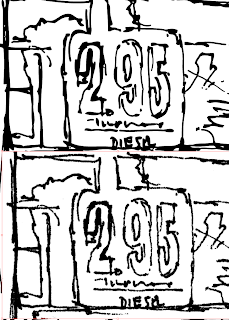
| Top: vectorized drawing in illustrator. File size of finished colored drawing is 1.8mb. Bottom: scan of original ink drawing. 1270 dpi and the file size is 136.7mb. |
THE SCAN
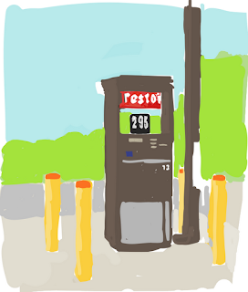
I made a high resolution scan of the ink drawing and created a low resolution jpg of it so that it would be small enough to email to myself and import into Adobe Ideas. This was just a temporary file that I used for coloring.Coloring a scan in Adobe Ideas was an experiment. I found that it doesn't work very well because the photo has to be the bottom layer so the only option is to color on a layer above it. This is a problem because the coloring progressively hides the scan and then it becomes difficult to tell where the edges are. I compensated for this by making the coloring layer slightly transparent so that the line work would show through but then it became difficult to judge the darkness of the colors. I was tempted to abandon the drawing but then I decided to finish it in Illustrator. When I had most of the colors blocked in, I shut off the photo layer and emailed the drawing to myself as a pdf.
 |
| The colors with the line drawing layer turned off in Adobe Ideas. I emailed it as a pdf to myself and opened in illustrator. Some of the colors seemed too bright, especially the green. |
VECTORIZE THE SCAN IN ILLUSTRATOR*
I imported the high resolution scan of the ink drawing into Illustrator and vectorized it. When a placed file is selected in Illustrator a "live trace" button appears on the tool bar at the top of the screen (this bar is called the "application bar" and can be turned on and off from the "window" menu). It may be necessary to experiment with the tracing presets that are in the drop down menu (located to the left of the "live trace" button). The advantage of the vector drawing is that it can be enlarged without degrading the image, the file size is dramatically smaller than a scan and the edges of the lines are sharper.
*Vectorizing means transforming a raster image into path points in Illustrator.
COMBINING THE ADOBE IDEAS COLORING WITH THE ILLUSTRATOR VECTOR LINE DRAWING
I opened the pdf in Illustrator and copied and pasted it into the file that contained the black and white line drawing. I had to scale and move it around until they both lined up. The colors looked brighter and more saturated when imported into Illustrator and I think this is because the iPad doesn't support color profiles. I used the "edit colors" feature in Illustrator to make adjustments so that closely matched how it originally appeared on the iPad. The line drawing was on the topmost layer while I colored on a layer below it. It took maybe another two hours to finish it.
This was a fun drawing to work on and it felt good to make use of the time that would normally have been wasted. It's surprising how much can be accomplished in a series of small segments of time.
If you like this you may be interested in more of my iPad Art
If you like this you may be interested in more of my iPad Art
No comments:
Post a Comment